Appmaker Config Form
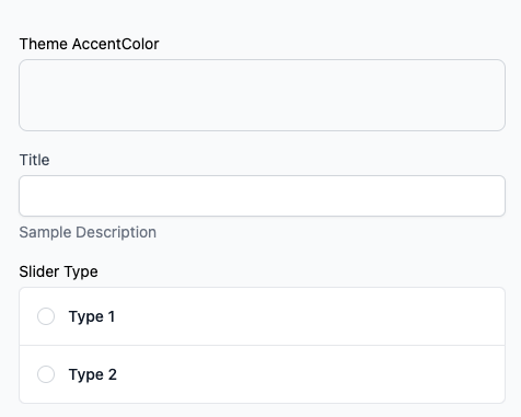
Appmaker Form config is used to render the form in the Appmaker Dashboard. The form is rendered based on the JSON schema provided in the attributesSchema property of the block schema.
Example
{
  "properties": [
    {
      "id": "background_color",
      "label": "Theme AccentColor",
      "uiType": "ColorPicker",
      "type": "string"
    },
    {
      "id": "title",
      "label": "Title",
      "type": "string",
      "description": "Sample Description"
    },
    {
      "id": "slider_type",
      "type": "string",
      "title": "Slider Type",
      "uiType": "RadioGroup",
      "options": [
        {
          "label": "Type 1",
          "value": "type-2"
        },
        {
          "label": "Type 2",
          "value": "type-2"
        }
      ]
    }
  ]
}
Output
Standard attributes
The following attributes are standard for all input settings. However, there might be additional attributes for specific input types.
| Attribute | Description | Required |
|---|---|---|
uiType | The type of UI component to render. | Yes |
type | The type of input. | Yes |
label | The label of the input. | Yes |
description | The description of the input. | No |
Input types
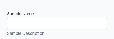
String
The string input type is used for text input.
{
  "properties": [
    {
      "id": "name",
      "type": "string",
      "label": "Sample Name",
      "description": "Sample Description"
    }
  ]
}
The above code will generate the following input:
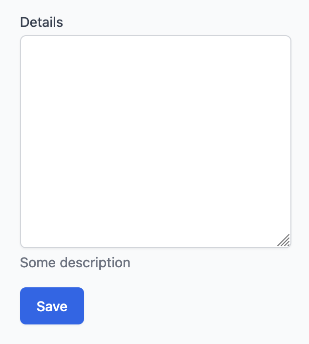
Text Area
{
  "properties": [
    {
      "id": "details",
      "type": "string",
      "label": "Details",
      "description": "Some description",
      "inputType": "textArea",
      "rows": 10
    }
  ]
}
The above code will generate the following input:
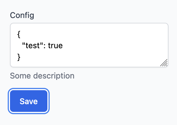
JSON
{
  "properties": [
    {
      "id": "config",
      "type": "string",
      "label": "Config",
      "description": "Some description",
      "uiType": "json"
    }
  ]
}
The above code will generate the following input:
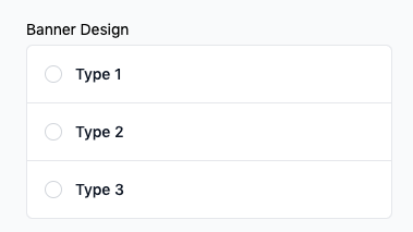
Radio Group
You can set the uiType to RadioGroup to render the input as a radio group. You can also set the options attribute to set the options for the radio group.
{
  "properties": [
    {
      "id": "selectBannerDesign",
      "type": "string",
      "uiType": "RadioGroup",
      "title": "Banner Design",
      "options": [
        {
          "label": "Type 1",
          "value": "type-1"
        },
        {
          "label": "Type 2",
          "value": "type-2"
        },
        {
          "label": "Type 3",
          "value": "type-3"
        }
      ]
    }
  ]
}
The above code will generate the following input:
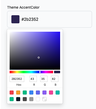
Color Picker
You can set the uiType to ColorPicker to render the input as a color picker.
{
  "properties": [
    {
      "id": "themeFontColor",
      "uiType": "ColorPicker",
      "type": "string",
      "label": "Theme Font Color"
    }
  ]
}
The above code will generate the following input:
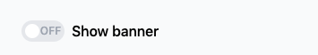
Switch
You can set the uiType to Switch to render the input as a switch.
{
  "properties": [
    {
      "id": "show_banner",
      "type": "string",
      "uiType": "switch",
      "label": "Show banner"
    }
  ]
}
Other supported properties are:
| Parameters | Description | value |
|---|---|---|
| defaultValue | To set the default value of the switch | false |
The above code will generate the following input:
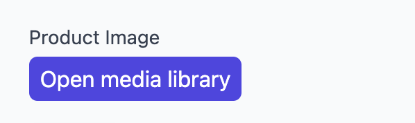
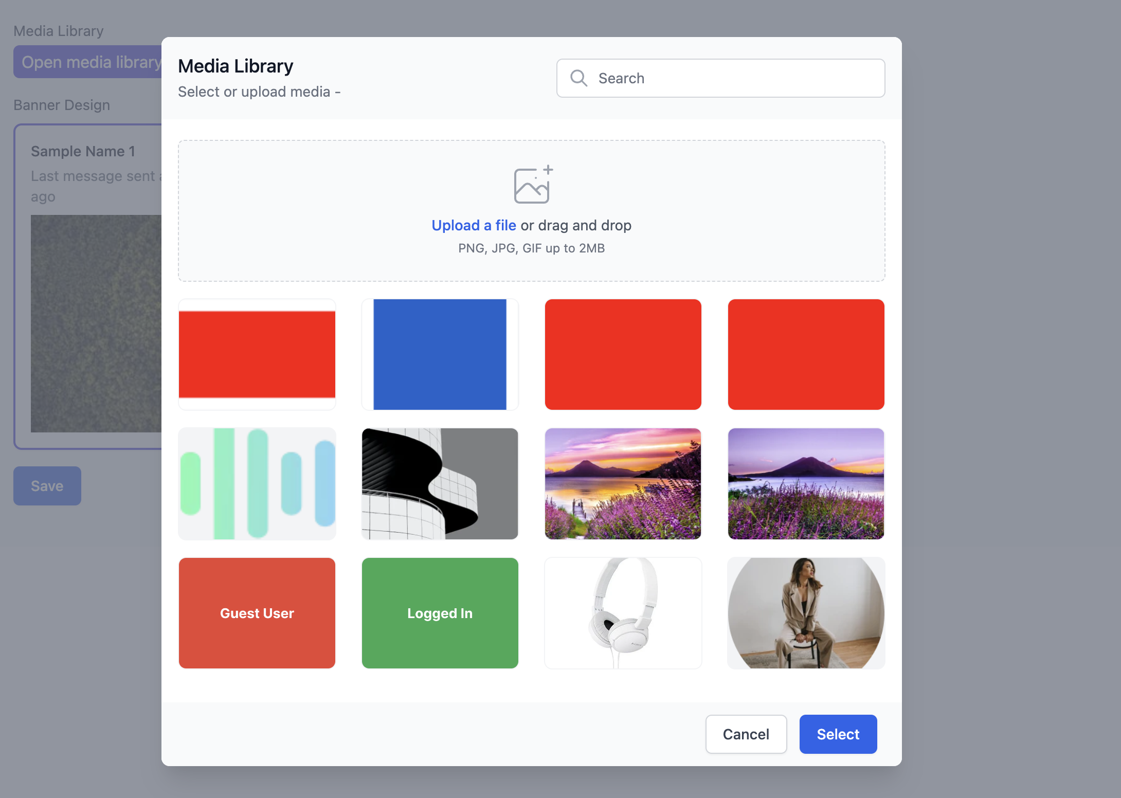
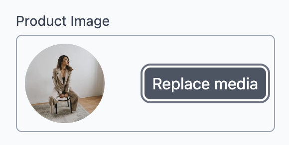
Media Library
You can set the uiType to appmaker-media-library to render the media modal.
{
  "properties": [
    {
      "id": "image",
      "type": "string",
      "uiType": "appmaker-media-library",
      "label": "Product Image"
    }
  ]
}
{
  "properties": [
    {
      "id": "custom_name",
      "type": "appmaker-media-library",
      "label": "Sample Name",
      "description": "Sample Description",
      "mediaTypes": ["video", "image"],
      "dropzoneHelperText": "PNG, JPG, GIF, MP4 up to 2MB",
      "acceptedFile": "image/*"
    }
  ]
}
| Parameters | Description | data type | values | required |
|---|---|---|---|---|
| mediaTypes | To show and upload the media types | Array | ["video","image"] | false |
| dropzoneHelperText | override text shown inside media library when uploading | String | any | false |
| acceptedFile | override the accepted file while uploading | string | Any MIME type (example: "video/mp4") | false |
| disableImageResize | To disable image resize.Default is false | Boolean | true/false | false |
| maxWidth | To set max width for the image | String or Integer | Integer Value | false |
| maxHeight | To set max height for the image (If maxWidth is set maxHeight is omitted) | String or Integer | Integer Value | false |
Above code will generate the following form:
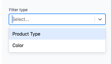
Select
You can set the uiType to Select to render the input as a dropdown.
{
  "properties": [
    {
      "id": "filterType",
      "type": "string",
      "uiType": "select",
      "label": "Filter type",
      "options": [
        {
          "label": "Product Type",
          "value": "Product Type"
        },
        {
          "label": "Color",
          "value": "Color"
        }
      ]
    }
  ]
}
| Parameters | Description | data type | values | required |
|---|---|---|---|---|
| creatable | custom create | boolean | true/false | false |
| multi | create multiple input | boolean | true/false | false |
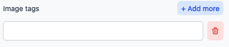
Infinite Text
You can set the uiType to infinite-text to render the infinite text box.
{
  "properties": [
    {
      "id": "imageTags",
      "type": "array",
      "uiType": "infinite-text",
      "label": "Image tags"
    }
  ]
}
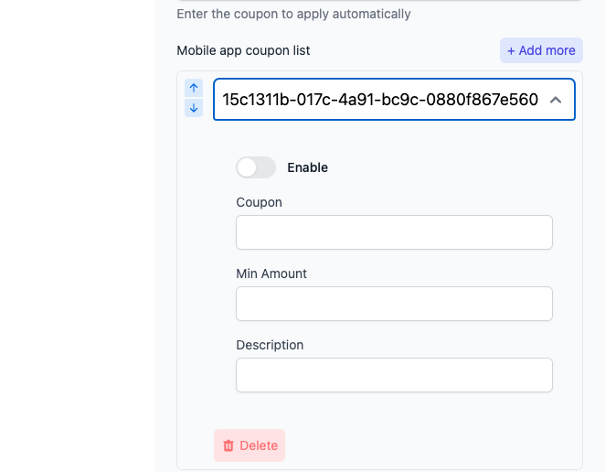
Infinite Form
{
  "properties": [
    {
      "id": "coupons",
      "type": "array",
      "uiType": "infinite-form",
      "label": "Mobile app coupon list",
      "labelKey": "coupon",
      "properties": [
        {
          "id": "enable",
          "type": "string",
          "label": "Enable",
          "uiType": "switch"
        },
        {
          "id": "coupon",
          "type": "string",
          "label": "Coupon"
        },
        {
          "id": "min_amount",
          "type": "string",
          "label": "Min Amount"
        },
        {
          "id": "description",
          "type": "string",
          "label": "Description"
        }
      ]
    }
  ]
}
Example 2
{
  "properties": [
    {
      "id": "filterType",
      "type": "string",
      "uiType": "select",
      "label": "Filter type",
      "creatable": true,
      "options": [
        {
          "label": "Product Type",
          "value": "Product Type"
        },
        {
          "label": "Color",
          "value": "Color"
        }
      ]
    },
    {
      "id": "show_banner",
      "type": "string",
      "uiType": "Switch",
      "label": "Show banner"
    },
    {
      "id": "selectBannerDesign",
      "type": "string",
      "uiType": "RadioGroup",
      "title": "Banner Design",
      "options": [
        {
          "label": "Type 1",
          "value": "type-1"
        },
        {
          "label": "Type 2",
          "value": "type-2"
        },
        {
          "label": "Type 3",
          "value": "type-3"
        }
      ]
    }
  ]
}
Above code will generate the following form:
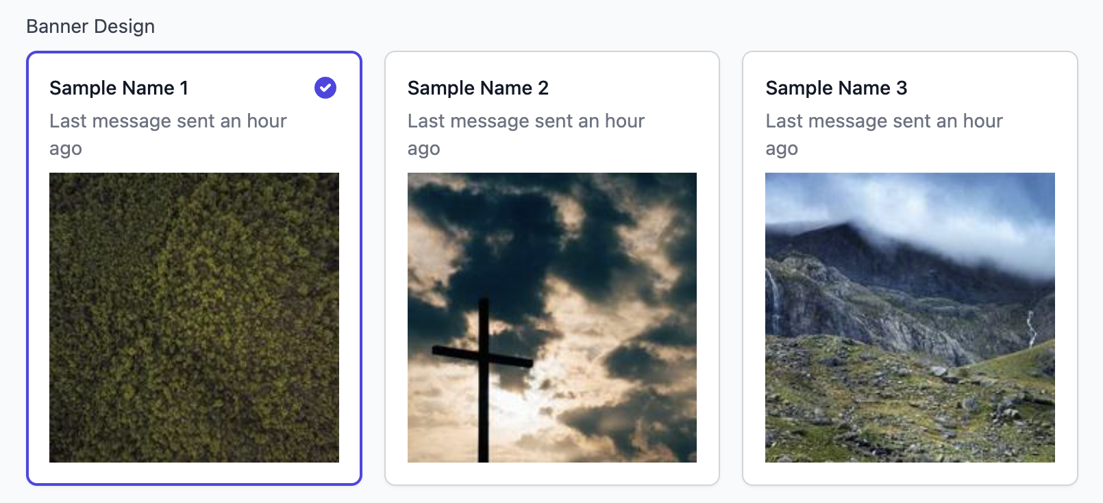
Image Radio Group
You can set the uiType to image-radio to render the input as a image radio group. You can also set the options attribute to set the options for the radio group.
{
  "properties": [
    {
      "id": "selectBannerDesign",
      "type": "string",
      "uiType": "image-radio",
      "title": "Banner Design",
      "options": [
        {
          "label": "Sample Name 1",
          "description": "Last message sent an hour ago",
          "imgSrc": "https://picsum.photos/200?random=1"
        },
        {
          "label": "Sample Name 2",
          "description": "Last message sent an hour ago",
          "imgSrc": "https://picsum.photos/200?random=2"
        },
        {
          "label": "Sample Name 3",
          "description": "Last message sent an hour ago",
          "imgSrc": "https://picsum.photos/200?random=3"
        }
      ]
    }
  ]
}
The above code will generate the following input:
Range Slider
{
  "properties": [
    {
      "id": "gap",
      "type": "string",
      "uiType": "RangeSlider",
      "label": "Gap",
      "default": 50,
      "min": 1,
      "max": 500
    }
  ]
}
The above code will generate the following input:
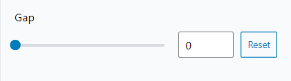
| Parameters | Description |
|---|---|
| default | To set the default value of the slider |
| min | To set the minimum value of the slider |
| max | To set the maximum value of the slider |
Date Time Picker
{
  "properties": [
    {
      "id": "chooseTime",
      "type": "string",
      "uiType": "date-time",
      "label": "Time to show",
      "title": "choose me",
      "minDate": "2024-01-01",
      "maxDate": "2028-12-31"
    }
  ]
}
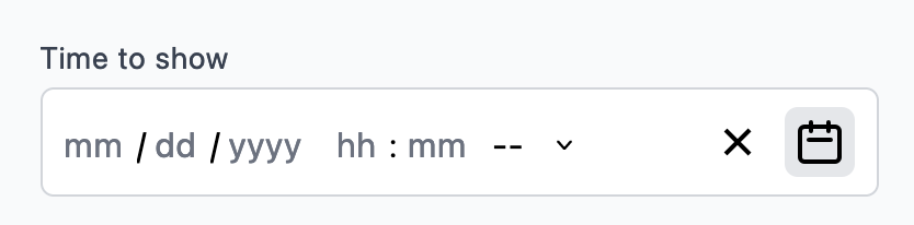
| Parameters | Description | Default Value |
|---|---|---|
| title | Title of the date picker | |
| disableClock | Disable the clock for time selection | true |
| minDate | Minimum selectable date (YYY-MM-DD) | |
| maxDate | Maximum selectable date (YYY-MM-DD) | |
| dayPlaceholder | Placeholder for day input | "dd" |
| monthPlaceholder | Placeholder for month input | "mm" |
| yearPlaceholder | Placeholder for year input | "yyyy" |
| secondPlaceholder | Placeholder for second input | "ss" |
| minutePlaceholder | Placeholder for minute input | "mm" |
| hourPlaceholder | Placeholder for hour input | "hh" |
| className | Additional class for styling |
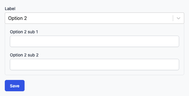
Conditional
{
  "properties": [
    {
      "id": "conditional-block",
      "type": "conditional",
      "label": "Label",
      "placeholder": "Choose options",
      "options": [
        {
          "id": "option-1",
          "label": "Option 1",
          "properties": [
            {
              "id": "option-1-sub",
              "type": "string",
              "label": "Option 1 sub"
            }
          ]
        },
        {
          "id": "option-2",
          "label": "Option 2",
          "properties": [
            {
              "id": "option-2-sub-1",
              "type": "string",
              "label": "Option 2 sub 1"
            },
            {
              "id": "option-2-sub-2",
              "type": "string",
              "label": "Option 2 sub 2"
            }
          ]
        }
      ]
    }
  ]
}
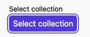
Collections
{
  "properties": [
    {
      "id": "collectionId",
      "label": "Select collection",
      "type": "collections"
    }
  ]
}
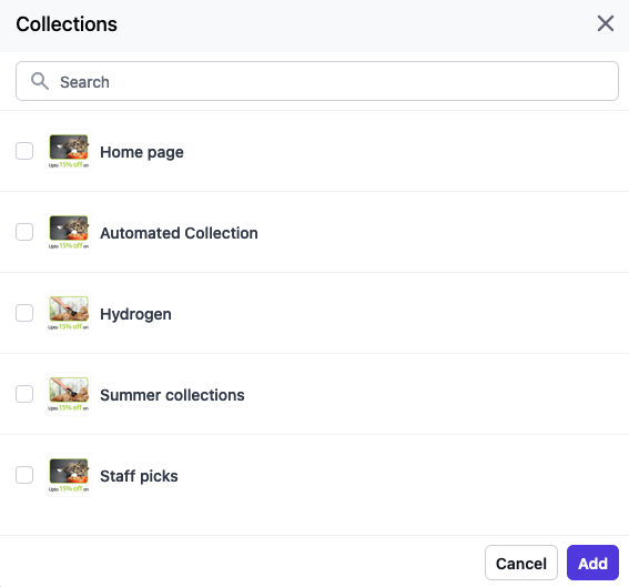
| Parameters | Description | Default Value |
|---|---|---|
| isMulti | To select multiple options | false |
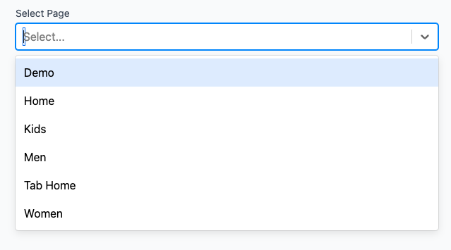
In-App Page
Form type for selecting the in-app pages. This will allow you to select the in-app pages from the dashboard.
{
  "properties": [
    {
      "id": "pageId",
      "type": "string",
      "uiType": "in-app-page",
      "label": "Select Page",
      "isMulti": false
    }
  ]
}
| Parameters | Description | Default Value |
|---|---|---|
| isMulti | To select multiple options | false |
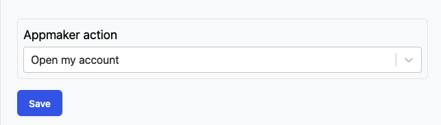
Appmaker Action
Form type for selecting the appmaker actions. This will allow you to select the appmaker actions from the dashboard.
{
  "properties": [
    {
      "id": "action_id",
      "type": "appmaker-action",
      "label": "Appmaker action"
    }
  ]
}
Product Selector
Form type for selecting the products. This will allow you to select the products from the store.
{
  "properties": [
    {
      "id": "product_gid",
      "type": "shopify-custom-product-variant",
      "label": "Product Id",
      "showProductOnly": true
    },
    {
      "id": "variant_gid",
      "type": "shopify-custom-product-variant",
      "label": "Variant Id",
      "parentKey": "product_gid",
      "showVariantOnly": true,
      "dependentErrorMessage": "Please choose the product to select the variant"
    }
  ]
}
Output:
{
  "product_gid": "gid://shopify/Product/451521445621",
  "variant_gid": "gid://shopify/ProductVariant/451521445621"
}
Form types for styling
Layout Styles
Form type for styling the layout of the app blocks. Using this form type will allow you to apply styles from the dashboard to the app components. You can apply styles mentioned in view-style-props
{
  "properties": [
    {
      "id": "containerStyles",
      "type": "string",
      "uiType": "layout-styles",
      "label": "Block Container Styles"
    }
  ]
}
Text Styles
Form type for styling the text of the app blocks. Using this form type will allow you to apply styles from the dashboard to the app components. You can apply styles mentioned in text-style-props
{
  "properties": [
    {
      "id": "textStyles",
      "type": "string",
      "uiType": "text-styles",
      "label": "Title Text Styles"
    }
  ]
}
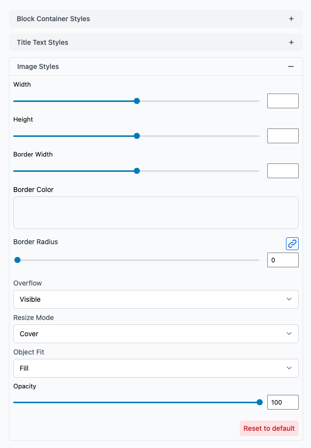
Image Styles
Form type for styling the image of the app blocks. Using this form type will allow you to apply styles from the dashboard to the app components. You can apply styles mentioned in image-style-props
{
  "properties": [
    {
      "id": "imageStyles",
      "type": "string",
      "uiType": "image-styles",
      "label": "Image Styles"
    }
  ]
}
Additional form types
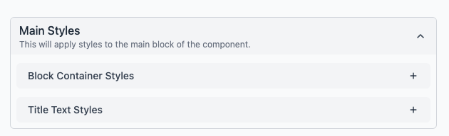
Group
Form type for grouping multiple properties together. This is useful when you want to group multiple properties together and apply. This will help to organize the properties in the dashboard.
{
  "properties": [
    {
      "id": "blockStyles",
      "type": "string",
      "uiType": "group",
      "label": "Main Styles",
      "description": "This will apply styles to the main block of the component.",
      "properties": [
        {
          "id": "containerStyles",
          "type": "string",
          "uiType": "layout-styles",
          "label": "Block Container Styles"
        },
        {
          "id": "textStyles",
          "type": "string",
          "uiType": "text-styles",
          "label": "Title Text Styles"
        }
      ]
    }
  ]
}
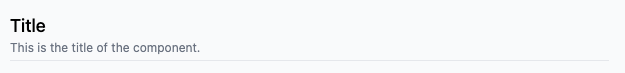
Title
Form type for adding a title to the form. This is useful when you want to add a title to the form or in between the properties. This will help to organize the properties in the dashboard.
{
  "properties": [
    {
      "id": "title",
      "type": "string",
      "uiType": "title",
      "label": "Title",
      "description": "This is the title of the component.",
      "size": "h1"
    }
  ]
}
| Prop | Type | Description |
|---|---|---|
size | string | Size of the title. Possible values are h1, h2, h3 |