App Theme
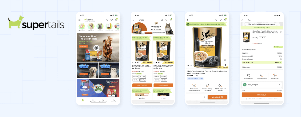
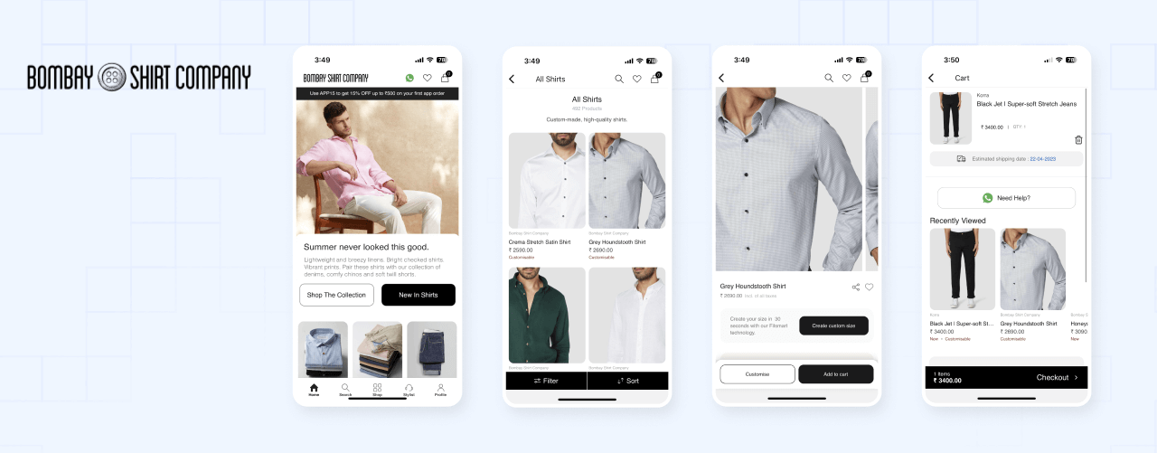
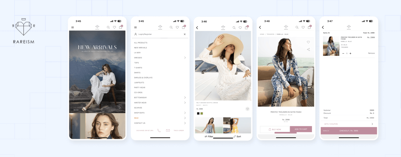
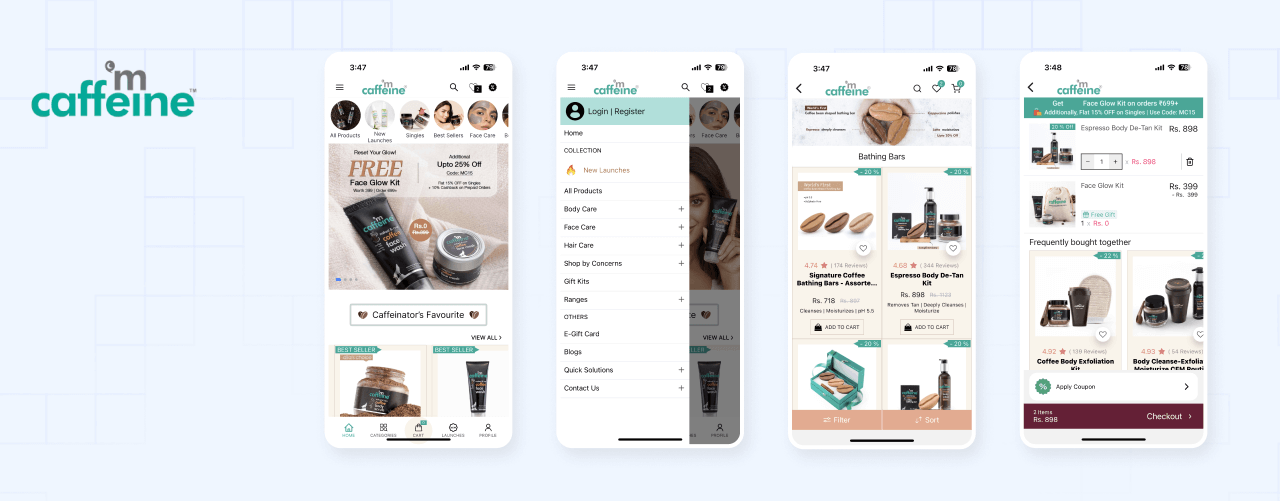
App theme is the visual appearance of the app. It includes the colors, fonts, and other visual elements that are used in the app. You can customize the app theme by changing the colors, fonts, and other visual elements such as individual components, layouts, and screens. The app look and feel like collection listing page, product listing page, product detail page, cart page, and checkout page can be customized using the app theme. See examples of the app themes of live app below to get an idea of what you can do with the theme. These apps are live and you can download them from the app stores.


Starting a new theme
To install the theme, you need to have a working app. If you don't have an app, you can create one using the App Maker CLI. A brief overview of the steps to create a new theme is given below.
Prior to creating a new theme or extension locally, you must first create it on https://partners.appmaker.xyz/.
appmaker init
Select the theme from the list of options in the prompt, and select the theme you want to install.
cd <theme/theme-id>
npm install
Running the app
Refer to the docs for more details on running the app Refer to the Running the app section for more details on running the app.
Customizing the theme
Now that you have set up the starter app, you can start customizing the theme. You can customize the pages and components(blocks) of the app using the theme.
Theme files will be located in the packages/theme-id folder. The recommended structure of the theme is given below. If the you could not find the folders and files mentioned below, you can create them as required.
Theme structure
packages
└── <theme-id>
    ├── src
    │   ├── assets
    │   │   ├── fonts
    │   │   │   └── Roboto-Regular.ttf
    │   │   └── images
    │   │       ├── logo.png
    │   │       └── star.svg
    │   ├── blocks
    │   │   └── index.js
    │   ├── components
    │   │   └── ProductGridItem.js
    │   ├── pages
    │   │   └── index.js
    │   └── index.js
    ├── appmaker.json
    └── package.json
The theme structure is similar to the app structure. The theme has the following files and folders.
assets- Contains the assets used in the theme. The assets can be images, fonts, and other files.blocks- Contains the blocks used in the theme. The blocks are the individual components that are used in the app. The blocks are the building blocks of the app.components- Contains the components used in the theme. The components are the individual components that are used in the app. The components are the building blocks of the app.pages- Contains the pages used in the theme. The pages are the individual components that are used in the app. The pages are the building blocks of the app.src- Contains the theme configuration.