Appmaker Theme Overview
The visual appearance, user experience, and functionality of an app are largely determined by its theme, making it a crucial aspect for both developers and users.
To build themes for Appmaker, developers use a combination of React Native components and JSON. These tools allow them to create a customized look and feel that matches their clients' requirements. React Native provides developers with several resources and guidelines to help them develop high-quality themes efficiently.
As a React Native app developer, you have the flexibility to create custom themes that cater to the specific needs and preferences of your clients. You can also personalize existing blocks and pages to create a unique look and feel for your app or create new blocks and pages to enhance your app's functionality.
Appmaker Theme Anatomy
An app's theme determines its structure, features, and design. The code for an Appmaker theme follows a standard directory structure and includes supporting assets such as images, stylesheets, and fonts.
As a developer, you need to optimize your theme's structure, features, and design to meet the specific needs of your target audience or use case. The best themes are customized to the users' preferences and requirements.
Page Structure
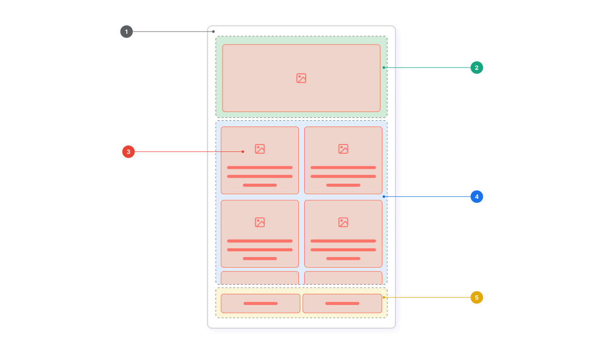
An app's theme is composed of pages and blocks. Pages are the main building blocks of an app and are used to display content to the user. Blocks are the building blocks of pages and are used to display content to the user.

- Page: page is the main building block of an app and is used to display content to the user.
- Layout: layout is used as the container for the blocks.
- Repeatable block layout: repeatable block layout is used to display a list of blocks.
- Block: block is the main visual element of a page and is used to display content to the user.
- Sticky footer layout: sticky footer layout is used to display a footer at the bottom of the page.
Supporting assets
It's possible to enhance the appearance of components and features or store reusable code snippets that can be utilized in multiple components by incorporating supporting assets into your theme.
For example, you can change create a custom font and use it in your theme to change the font of the app's text. In another scenario, you can create a custom button component and use it in your theme block components to ensure that all buttons in the app have the same look and feel.