Replace drawer menu page and menu items with custom components
Description
This document provides instructions on how to substitute the default drawer menu page and menu items with custom components. This is particularly valuable when you want to incorporate personalized elements into the dra`wer menu, such as a custom header, footer, or custom menu items.
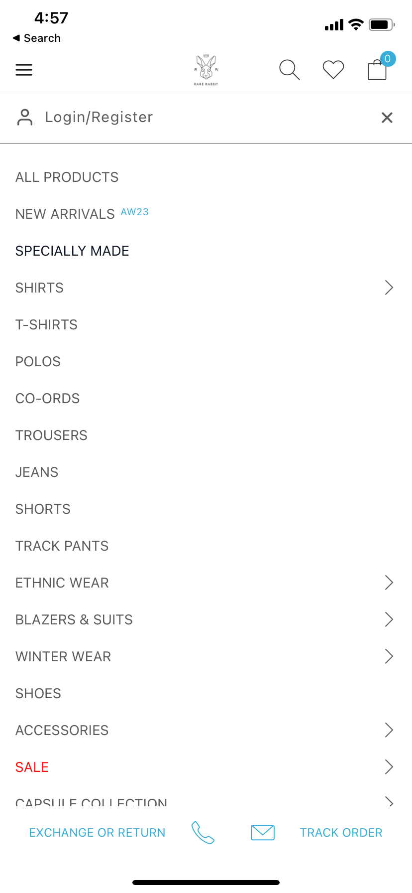
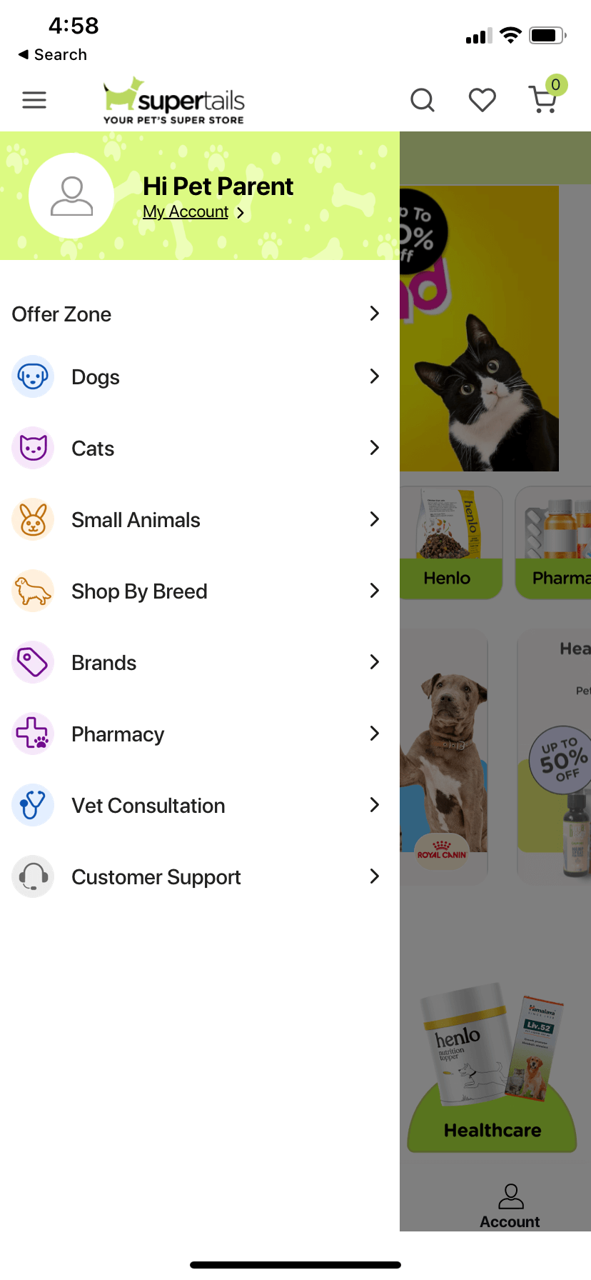
Example
Steps
Create a page file named
DrawerMenu.jsin thesrc/pagesfolder.Add the following code to the
DrawerMenu.jsfile.
const DrawerMenu = {
  parentID: "mainmenu",
  id: "mainmenu",
  blocks: [
    // add your custom blocks here if any
    {
      name: "appmaker/core-menu",
      clientId: "drawer-menu",
      // Note: core-menu block will provide the menu items added in the appmaker dashboard
    },
  ],
  stickyFooter: [
    // add your custom blocks here if any
  ],
  attributes: {},
};

export default DrawerMenu;
- import the
DrawerMenupage in thesrc/pages/index.jsfile.
import DrawerMenu from "./DrawerMenu";

const pages = {
  DrawerMenu,
};

export { pages };
Ensure that you include the pages module within the registerTheme function located in the src/index.js file.
- Create a component in
src/componentsfolder to represent the core menu items added in the appmaker dashboard.
Core menu (Sample Component)
import React, { useState } from "react";
import {
  FlatList,
  Image,
  Pressable,
  StyleSheet,
  Text,
  View,
} from "react-native";
import Icon from "react-native-vector-icons/SimpleLineIcons";

const MenuItem = ({ item, onAction }) => {
  const {
    icon,
    title,
    action,
    nodes = [],
    fontColor,
    badge,
    badgeColor,
    badgeText,
    badgeTextColor,
    dotIndicator,
    dotIndicatorColor,
    dotSize,
  } = item;
  const innerBlocks = nodes;
  const [expandState, setExpandState] = useState(false);
  return (
    <View>
      <Pressable
        style={styles.pressableView}
        onPress={() => {
          if (innerBlocks.length > 0) {
            setExpandState(!expandState);
          } else {
            onAction(action);
          }
        }}
      >
        <View style={styles.viewRow}>
          {icon ? <Image source={{ uri: icon }} style={styles.image} /> : null}
          <Text
            numberOfLines={1}
            style={[styles.textRow, { color: fontColor || "#5C5C5C" }]}
          >
            {title}
          </Text>
          {badge ? (
            <View
              style={[
                styles.badgeTextContainer,
                {
                  backgroundColor: badgeColor,
                },
              ]}
            >
              <Text
                style={[
                  styles.badgeText,
                  {
                    color: badgeTextColor,
                  },
                ]}
              >
                {badgeText}
              </Text>
            </View>
          ) : null}
          {dotIndicator ? (
            <View
              style={[
                styles.dotIndicator,
                {
                  width: dotSize,
                  height: dotSize,
                  backgroundColor: dotIndicatorColor,
                },
              ]}
            />
          ) : null}
        </View>
        {innerBlocks.length > 0 ? (
          <Icon name={expandState ? "arrow-down" : "arrow-right"} size={12} />
        ) : null}
      </Pressable>
      {innerBlocks.length > 0 && expandState === true ? (
        <FlatList
          data={innerBlocks}
          renderItem={({ item }) => (
            <MenuItem item={item} onAction={onAction} />
          )}
          keyExtractor={(item) => item.id}
          style={styles.innerContainer}
        />
      ) : null}
    </View>
  );
};

const CoreMenu = ({ attributes, onAction }) => {
  const menuItems = attributes?.menuItems?.blocks;
  return (
    <FlatList
      data={menuItems}
      renderItem={({ item }) => <MenuItem item={item} onAction={onAction} />}
      keyExtractor={(item) => item.id}
      contentContainerStyle={styles.container}
    />
  );
};

const styles = StyleSheet.create({
  container: {
    paddingHorizontal: 10,
  },
  pressableView: {
    paddingVertical: 10,
    flexDirection: "row",
    justifyContent: "space-between",
    alignItems: "center",
    flex: 1,
  },
  viewRow: {
    flexDirection: "row",
    alignItems: "center",
    flexShrink: 1,
  },
  image: {
    width: 22,
    height: 22,
    marginRight: 10,
  },
  textRow: {
    fontSize: 14,
    marginRight: 5,
    color: "#5C5C5C",
    flexShrink: 1,
  },
  innerContainer: {
    paddingLeft: 10,
  },
  badgeText: {
    fontSize: 12,
  },
  badgeTextContainer: {
    paddingHorizontal: 5,
    paddingVertical: 2,
    borderRadius: 5,
    marginLeft: 5,
  },
  dotIndicator: {
    borderRadius: 50,
    marginLeft: 6,
  },
});

export default CoreMenu;
- In the
src/blocks/index.jsfile, please make sure to register the Menu component under the nameappmaker/core-drawer-menu.
import CoreMenu from "../components/CoreMenu";

const blocks = [
  {
    name: "appmaker/core-drawer-menu",
    View: CoreMenu,
  },
];

export { blocks };
- The menu items you've added in the appmaker dashboard will be displayed within the drawer menu. Feel free to modify the
CoreMenucomponent to tailor the menu items according to your specific needs.
Please refrain from substituting the appmaker/core-menu block, as it is essential for displaying menu items in the appmaker dashboard. If you replace the appmaker/core-menu block, the menu items in the appmaker dashboard will no longer appear. Instead, consider replacing it with the appmaker/core-drawer-menu block if you wish to customize the menu items.
Customizing the drawer menu header
- Create a component in
src/componentsfolder to represent the drawer menu header.
Drawer menu header (Sample Component)
import React from "react";
import { Pressable, StyleSheet, Text, View } from "react-native";
import Icon from "react-native-vector-icons/FontAwesome";
import { useUser } from "@appmaker-xyz/shopify";

const DrawerMenuHeader = (props) => {
  const { isLoggedin, user } = useUser(props);

  const firstName = user?.firstName;
  const lastName = user?.lastName;
  return (
    <Pressable
      onPress={() =>
        isLoggedin
          ? props.onAction({ action: "OPEN_MY_ACCOUNT" })
          : props.onAction({ action: "OPEN_LOGIN_PAGE" })
      }
      style={styles.container}
    >
      <Icon name="user-circle" size={24} color="#000000" style={styles.icon} />
      {isLoggedin ? (
        firstName || lastName ? (
          <Text>
            {firstName} {lastName}
          </Text>
        ) : (
          <Text>Welcome</Text>
        )
      ) : (
        <Text>Login</Text>
      )}
    </Pressable>
  );
};

const styles = StyleSheet.create({
  container: {
    flexDirection: "row",
    alignItems: "center",
    padding: 10,
    backgroundColor: "#f1f2f5",
  },
  icon: {
    marginRight: 10,
  },
});

export default DrawerMenuHeader;
The DrawerMenuHeader component uses the useUser hook to determine whether the user is logged in or not. If the user is logged in, the component will display the user's first name and last name. If the user is not logged in, the component will display the text "Login". Refer to the useUser hook documentation for more information.
- In the
src/blocks/index.jsfile, please make sure to register the DrawerMenuHeader component under the nameappmaker/drawer-menu-header.
import DrawerMenuHeader from "../components/DrawerMenuHeader";

const blocks = [
  // other blocks
  {
    name: "appmaker/drawer-menu-header",
    View: DrawerMenuHeader,
  },
];

export { blocks };
- In the
src/pages/DrawerMenu.jsfile, please make sure to add theappmaker/drawer-menu-headerblock toblocksarray.
const DrawerMenu = {
  parentID: "mainmenu",
  id: "mainmenu",
  blocks: [
    // other blocks
    {
      name: "appmaker/drawer-menu-header",
      clientId: "drawer-menu-header",
    },
  ],
  stickyFooter: [
    // other blocks
  ],
  attributes: {},
};

export default DrawerMenu;
- The drawer menu header will be displayed within the drawer menu. Feel free to modify the
DrawerMenuHeadercomponent to tailor the menu items according to your specific needs.