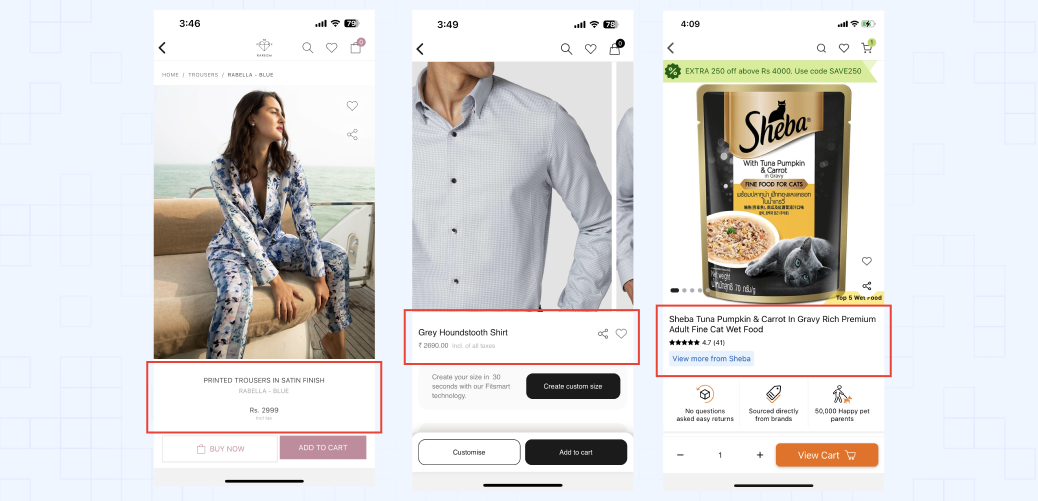
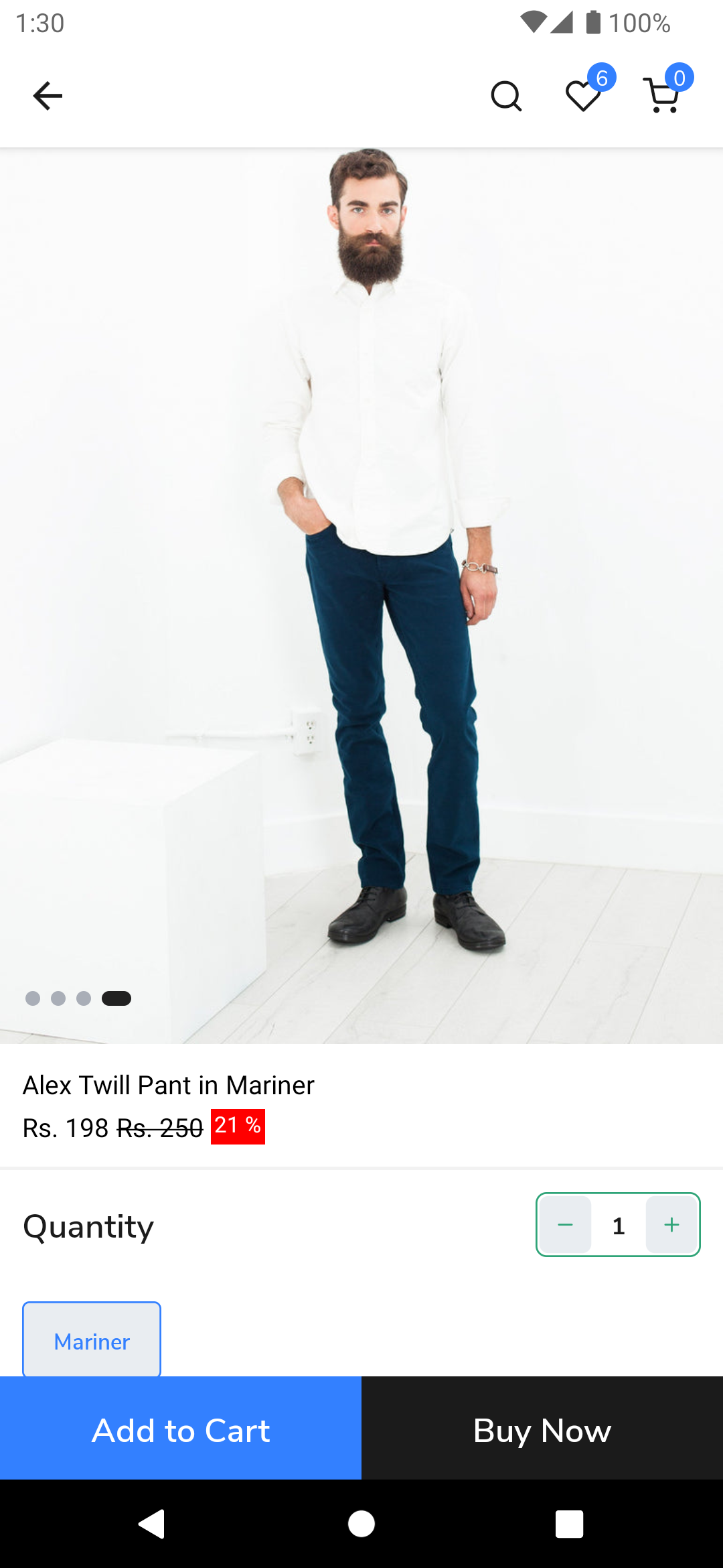
Customize Product Data Card
The Product Data Card is used to display the product details. It is used in the product detail page.
Examples of customized Product Data Card

The Product Data Card can be customized using the theme. The following sections describe how to customize the Product Data Card.
Steps to customize
- create a folder named
componentsin thesrcfolder of the theme. - create a file named
ProductData.jsin thecomponentsorcomponents/productDetailfolder as per your preference.
import React from "react";
import { StyleSheet, View, Text } from "react-native";
import { useProductDetail } from "@appmaker-xyz/shopify";

export default function ProductData(props) {
  const { title, regularPrice, salePercentage, salePrice } =
    useProductDetail(props);
  return (
    <View style={styles.container}>
      <Text>{title}</Text>
      <View style={styles.row}>
        <Text>{salePrice}</Text>
        <Text style={styles.strikePrice}>{regularPrice}</Text>
        {salePercentage && (
          <Text style={styles.salePercentage}>{salePercentage}</Text>
        )}
      </View>
    </View>
  );
}

const styles = StyleSheet.create({
  container: {
    backgroundColor: "#FFFFFF",
    padding: 12,
    marginBottom: 2,
  },
  row: {
    flexDirection: "row",
    marginTop: 4,
  },
  strikePrice: {
    textDecorationLine: "line-through",
    marginHorizontal: 4,
  },
  salePercentage: {
    fontSize: 12,
    backgroundColor: "#FF0000",
    paddingHorizontal: 2,
    color: "#FFFFFF",
  },
});
useProductDetailis a custom hook that returns the product details. It is used to get the product details from the product detail page. TheuseProductDetailhook is available in the@appmaker-xyz/shopifypackage. For more information, see the useProductDetail section.
- create a folder named
blocksin thesrcfolder of the theme. - create a file named
index.jsin theblocksfolder. - register the block in the
index.jsfile as appmaker/shopify-product-data.
import CollectionListItem from "../components/CollectionListItem";
import ProductData from "../components/ProductData";

const blocks = [
  {
    name: "appmaker/product-grid-item",
    View: CollectionListItem,
  },
  {
    name: "appmaker/product-data",
    View: ProductData,
  },
];

export { blocks };
- Run the app and check the changes.

Detailed information about customizing the Product Data Card can be found in the Customizing Product Data section.
The following file contain a sample design for the Product detail page. You can use this design as a reference to customize the Product Data. Sample Design