Implementing Recommendations in Cart via ProductList Component
A "You May Also Like" scroller in the cart can significantly increase the Average Order Value (AOV) by suggesting related items based on what the user has already added.
This guide demonstrates how to implement a custom recommendation block using the ProductList component and the useCart hook.
Core Concepts
useCartHook: Provides the current state of the cart, including thefirstProductId, which we use as a seed for Shopify's Product Recommendation API.ProductListComponent: A versatile component from@appmaker-xyz/shopifythat handles data fetching, analytics tracking, and rendering of product lists.
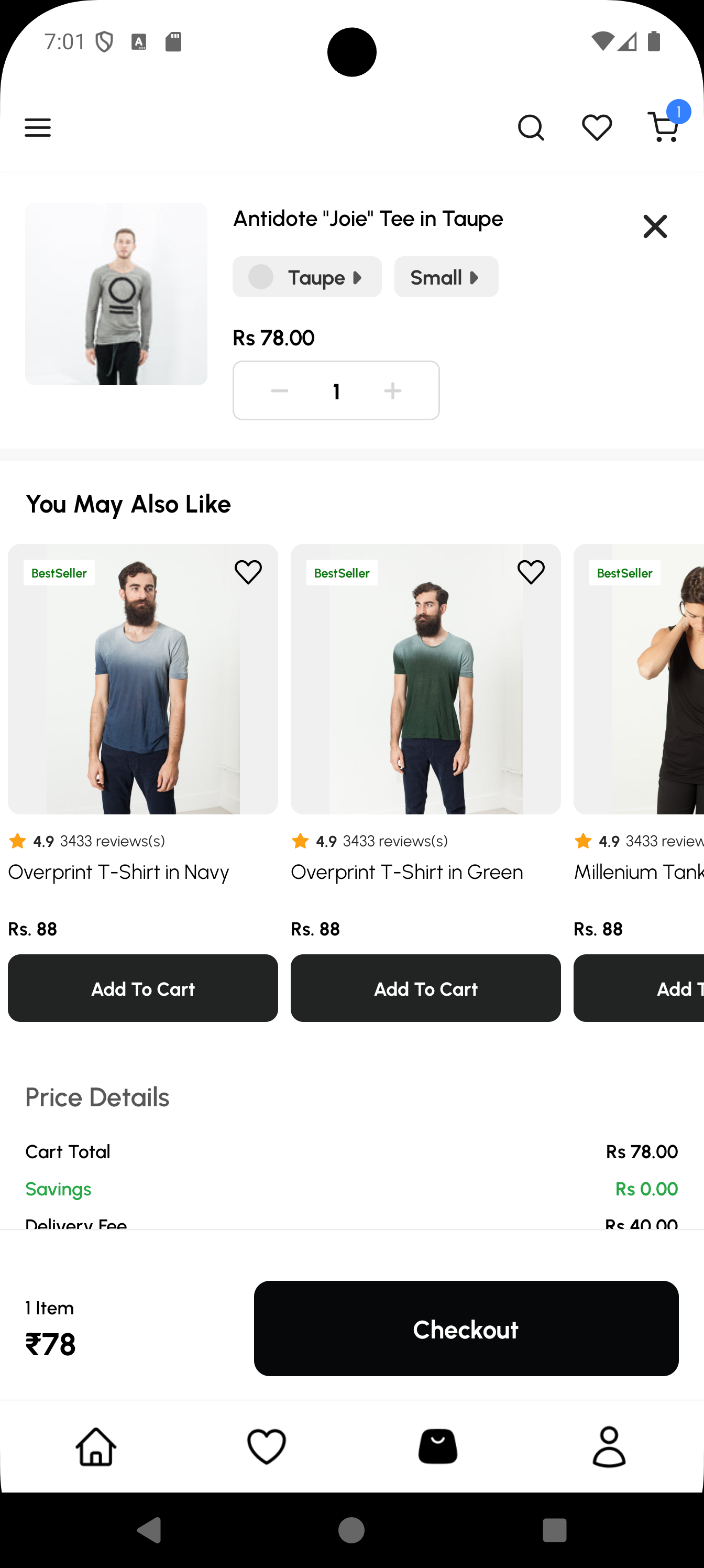
Preview
Implementation Approaches
There are two primary ways to add this block to your cart page:
- Approach A: Manual Page Schema (Recommended): Directly modifying the
page.schema.jsof your theme. This is the standard method for theme-specific pages. - Approach B: Dynamic Injection (Advanced): Using the
inapp-page-data-responsefilter to inject the block without modifying the schema files directly. This is ideal for cross-page injections or conditional logic.
Approach A: Manual Implementation Guide
1. Define the Page Schema (src/pages/CartPage/page.schema.js)
Add your custom block to the page structure.
const CartPageSchema = {
  blocks: [
    {
      name: 'shopify/cart-checkout',
      attributes: {},
    },
    {
      name: 'custom/cart-recommendations',
      attributes: {
        title: 'You May Also Like',
      },
    },
  ],
  title: 'Cart',
};
export default CartPageSchema;
2. Define the Block Mapping (src/pages/CartPage/blocks.schema.js)
Map the block name to your custom React component.
import RelatedProducts from './blocks/RelatedProducts';

const CartBlocks = [
  {
    name: 'custom/cart-recommendations',
    View: RelatedProducts,
  },
];
export default CartBlocks;
3. Create the Recommendation Component (RelatedProducts.js)
Use the ProductList component with the horizontal prop. Secure the firstProductId from the cart to drive the recommendations.
import React from 'react';
import { View, StyleSheet } from 'react-native';
import { ProductList, useCart } from '@appmaker-xyz/shopify';
import { ThemeText, Layout } from '@appmaker-xyz/ui';

const RelatedProducts = (props) => {
  const { firstProductId } = useCart();
  const title = props.attributes?.title || "You May Also Like";

  // Don't render anything if the cart is empty
  if (!firstProductId) return null;

  return (
    <View style={styles.container}>
      <ThemeText style={styles.title}>{title}</ThemeText>
      <ProductList
        productRecommendationId={firstProductId}
        horizontal={true}
        hideWhenEmpty={true}
        surface="cart-recommendations"
        referrer={{
          type: 'recommendation',
          name: 'cart-upsell',
          title: 'You May Also Like',
        }}
        // Pass standard props for block rendering
        BlockItemRender={props.BlockItemRender}
        onAction={props.onAction}
      />
    </View>
  );
};

const styles = StyleSheet.create({
  container: {
    paddingVertical: 20,
    backgroundColor: '#fff',
  },
  title: {
    fontSize: 18,
    fontFamily: 'bold',
    paddingHorizontal: 16,
    marginBottom: 12,
  },
});

export default RelatedProducts;
Full Attribute Reference (ProductList)
The ProductList component is highly configurable. Below is a complete list of available props you can use to customize its behavior.
Data Fetching Props
| Prop | Type | Description |
|---|---|---|
collectionQuery | object | Fetch products from a collection using { id } or { handle }. |
productIds | string[] | Fetch a specific set of products by their Shopify IDs. |
productRecommendationId | string | Seed product ID for Shopify's Recommendation API. |
search | object | Fetch results using a search query { query: 'text' }. |
limit | number | Maximum number of products to fetch in the initial request. |
additionalQueryParams | object | Extra parameters passed to the Shopify data source. |
Layout & UI Props
| Prop | Type | Description |
|---|---|---|
horizontal | boolean | If true, renders as a horizontal scroller. Defaults to false (grid). |
numColumns | number | Number of grid columns (default is 2). Ignored if horizontal={true}. |
hideWhenEmpty | boolean | If true, returns null if no products are found. |
loadingLayout | string | The skeleton type to show while loading (product-grid or product-scroller). |
loadingComponent | component | Provide a custom React element to show during initial load. |
emptyView | component | Provide a custom view to show when no results are found. |
useFlatlist | boolean | Forces use of standard FlatList instead of FlashList. |
flashListProps | object | Props passed directly to the underlying list (FlashList/FlatList). |
Item Customization Props
| Prop | Type | Description |
|---|---|---|
blockAttributes | object | Attributes passed to every product item block (e.g. { wishlist: true }). |
customProductGridBlock | string | Override the default block type used for items (standard is appmaker/product-grid-item). |
itemsDisabled | boolean | If true, disables interaction/clicks on the items. |
beforeProductRender | function | A callback to modify or filter the product list data before it renders. |
Analytics & Tracking
| Prop | Type | Description |
|---|---|---|
surface | string | Required. Identifier for the location of the list (used for tracking). |
referrer | object | Required. Context for the recommendation source { name, type, title }. |
onAction | function | The standard Appmaker action handler from props. |
BlockItemRender | component | The standard block renderer passed down from the parent block. |
Approach B: Dynamic Injection Guide (Advanced)
If you want to inject the recommendation scroller without modifying the theme's page.schema.js, you can use the inapp-page-data-response filter in your theme's activate function.
Inject via activate()
Register the filter to target the cartPageCheckout page.
// src/index.js
import { appmaker } from '@appmaker-xyz/core';

export function activate(params) {
  appmaker.addFilter(
    'inapp-page-data-response',
    'cart-recommendation-injection',
    (data, { pageId }) => {
      // Target the Cart Page
      if (pageId === 'cartPageCheckout') {
        data.blocks = data.blocks || [];

        // Check for existing block to prevent duplicates
        const isBlockAdded = data.blocks.some(
          (block) => block.name === 'custom/cart-recommendations'
        );

        if (!isBlockAdded) {
          // Find the position (e.g., after the cart header/line items)
          // Adding it at index 1 usually puts it after line items
          data.blocks.splice(1, 0, {
            name: 'custom/cart-recommendations',
            clientId: 'cart-recommendation-scroller',
            attributes: { title: 'You May Also Like' },
          });
        }
      }
      return data;
    },
  );
}
For more details on how this works, see the Injecting Blocks in Pages guide.
Theme Registration
Follow the standard modular pattern by collecting your schemas and blocks before registering them in the theme entry point.
1. Collect Page Schema (src/pages/index.js)
import CartPage from './CartPage/page.schema';

export const pages = {
  // ...
  cartPageCheckout: CartPage,
};
3. Collect Blocks (src/blocks.js)
import CartBlocks from './pages/CartPage/blocks.schema';

export const blocks = [
  // ...
  ...CartBlocks,
];
3. Register the Theme (src/index.js)
import { registerTheme } from '@appmaker-xyz/core';
import { pages } from './pages';
import { blocks } from './blocks';

registerTheme({
  id: 'my-theme',
  pages,
  blocks,
});