Filter customization
The Advanced filter customization extension allows you to customize the filter in your app. You can refer to the Advanced filter customization guide to learn more about the extension.
Prerequisites
You need to have Advanced filter customization extension installed in your Appmaker dashboard.
Steps to customize filter using Advanced filter customization extension
The default Filter types are LIST, COLOR_SWATCH, PRICE_RANGE and HIDDEN. You can customize the default filter types as well as the custom filter types.
This can be done with the help of shopify-filter-components filter.
Filter structure :
appmaker.addFilter(
    'shopify-filter-components',
    'core-theme',
    (filterOptionsComponents) => {
      // filterOptionsComponents is an array of filter components
      return filterOptionsComponents;
    },
  );
| Parameter | Description | Value |
|---|---|---|
| filterOptionsComponents | An array of filter components | COLOR_SWATCH, LIST, HIDDEN , PRICE_RANGE |
Customizing the default filter types
Let's say you want to customize the default filter type LIST.
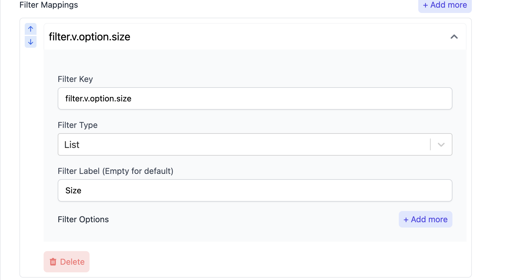
- In your
index.jsfile, add the following code snippet:
import { appmaker } from '@appmaker-xyz/core';
import FilterTabsIndex from './components/filter';

export function activateFunctions() {
  appmaker.addFilter(
    'shopify-filter-components',
    'core-theme',
    (filterOptionsComponents) => {
      filterOptionsComponents.LIST = FilterTabsIndex;
      return filterOptionsComponents;
    },
  );
}
- Create a new file
filter.jsin thecomponentsfolder and add the following code snippet:
import React from 'react';
import { CheckBox } from '@appmaker-xyz/ui';
import { useSelectedFilterItem } from '@appmaker-xyz/shopify';
import { FlatList, StyleSheet, Text } from 'react-native';

function CheckBoxItem({
  label,
  count,
  selectFilter,
  removeFilter,
  filterKey,
  item,
  parentItem,
}) {
  const isEmpty = item?.empty === true;
  const selectedItem = useSelectedFilterItem({
    filterKey,
    filterValueId: item.id,
  });
  const isUpperCase = parentItem?.upper_case || false;
  let colorStyle = {
    color: 'black',
  };
  if (isEmpty) {
    colorStyle = {
      color: '#A1A1AA',
    };
  }
  return (
    <CheckBox
      activeColor={'#000'}
      small={true}
      disable={isEmpty}
      label={
        <>
          <Text
            style={
              (isUpperCase
                ? styles.checkBoxItemCaptialize
                : styles.checkBoxItem,
              colorStyle)
            }>
            {label}
          </Text>
          <Text style={styles.activeCountText}>12({count})</Text>
        </>
      }
      value={selectedItem?.id === item.id}
      onValueChange={(status) => {
        if (status) {
          selectFilter(filterKey, item.id, item);
        } else {
          removeFilter(filterKey, item.id, item);
        }
      }}
    />
  );
}

// You can access the filter values from the item object
// Select the filter using selectFilter function
// Remove the filter using removeFilter function
function FilterListOption({ item, selectFilter, removeFilter }) {

  const { values } = item;

  function renderItem({ item: filterItem }) {
    return (
      <CheckBoxItem
        label={filterItem.label} // label of the filter
        count={filterItem.count}
        selectFilter={selectFilter}
        removeFilter={removeFilter}
        filterKey={item.id}
        item={filterItem}
        parentItem={item}
      />
    );
  }
  return (
    <FlatList
      data={values}
      renderItem={renderItem}
      contentContainerStyle={styles.filterContentViewContainer}
      keyExtractor={(item, index) => index.toString()}
    />
  );
}

const styles = StyleSheet.create({
  activeCountText: {
    color: '#64748B',
    padding: 2,
    borderRadius: 4,
    marginLeft: 10,
    fontSize: 12,
  },
  filterContentViewContainer: {
    padding: 10,
  },
  checkBoxItemCaptialize: {
    textTransform: 'capitalize',
  },
  checkBoxItem: {},
});

export default FilterListOption;
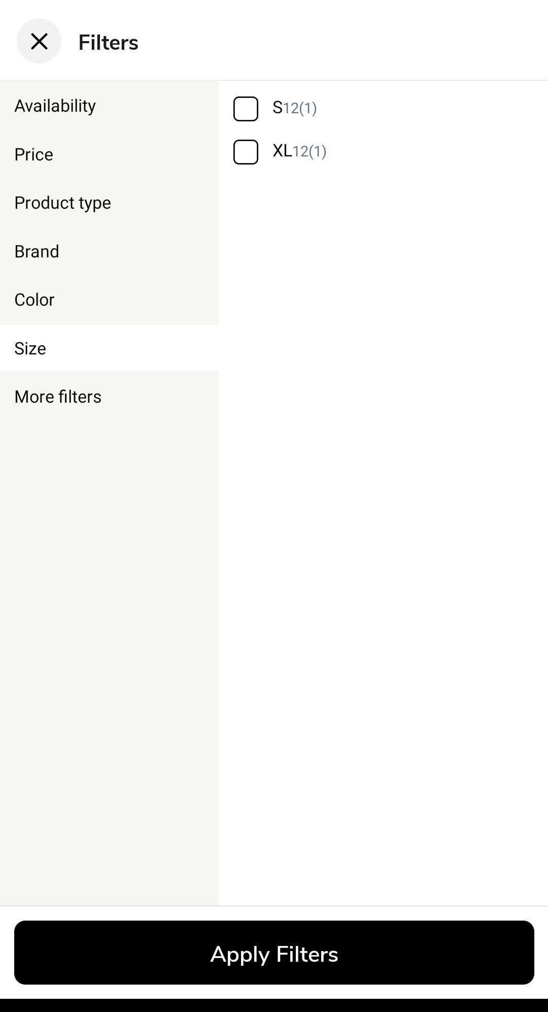
The filter will look like this:
You can customize the filter as per your requirements.
Let's say you want to show filter as a grid instead of a list.
You can set the numColumns prop of the FlatList component to 2 to show the filter as a grid.
    <FlatList
      data={values}
      renderItem={renderItem}
      contentContainerStyle={styles.filterContentViewContainer}
      numColumns={2}
      keyExtractor={(item, index) => index.toString()}
    />
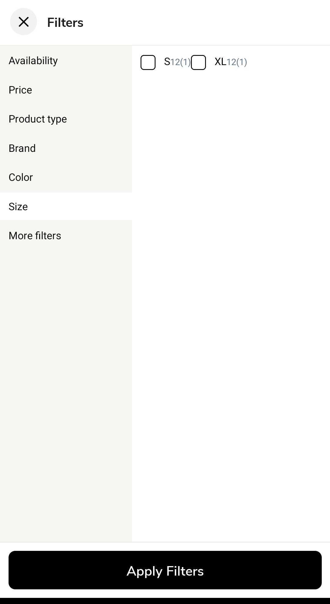
The filter will look like this:
Customizing the custom filter types
You can add your own custom filter types as well in the Advanced filter customization extension.
Let's say you want to add a new filter type DROPDOWN.
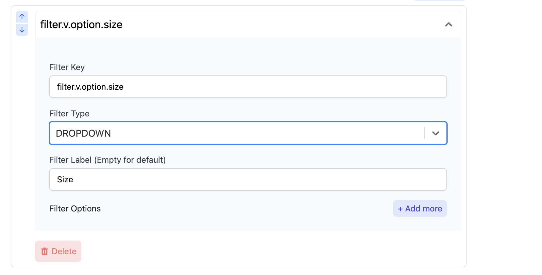
- In your
index.jsfile, add the following code snippet:
import { appmaker } from '@appmaker-xyz/core';
import FilterTabsIndex from './components/filter';

export function activateFunctions() {
  appmaker.addFilter(
    'shopify-filter-components',
    'core-theme',
    (filterOptionsComponents) => {
      filterOptionsComponents.DROPDOWN = FilterTabsIndex;
      return filterOptionsComponents;
    },
  );
}
- Write your custom filter component in the
filter.jsfile.